I am truly excited about Tailwind CSS version 4 new features! The latest release (while writing this post Tailwind is currently in version 4 beta) introduces some fantastic updates that we developers will love, there are many new things on the way. I am just going over some of my favorite breaking changes:
CSS-first Configuration
One of the standout Tailwind CSS version 4 new features is the ability to define configurations directly in CSS files. There will be no more tailwind.config.js files nor tailwind.config.ts files, I really like this because those config files can accumulate in the root level of the project, and fewer files have better readability, however, you can still create config files. But where can I set the configs, believe it or not, you can do that directly in the CSS file where you import Tailwind.
To read more about how to tune this check the CSS configuration in-depth documentation.
Simplified Theme Configuration
The new Tailwind CSS version 4 slims down the amount of theme configuration we need to add, some values that were previously configurable now support arbitrary inputs, like grid-cols-73, without requiring a predefined [73]. This change simplifies things, reducing unnecessary boilerplate and streamlining the process.
Container Queries
We could use container query from before in version 3 with the plugin, we do not need this anymore it just works out of the box. Tailwind v4 now includes built-in support for container queries. If you’re unfamiliar with container queries, here’s a quick explanation:
In Tailwind, you might use utilities like md: or sm: to apply styles based on the screen size. These are tied to the size of the browser window. With container queries, however, styles are applied based on the size of a container instead.
We are using the width of the container, not the width of the window.
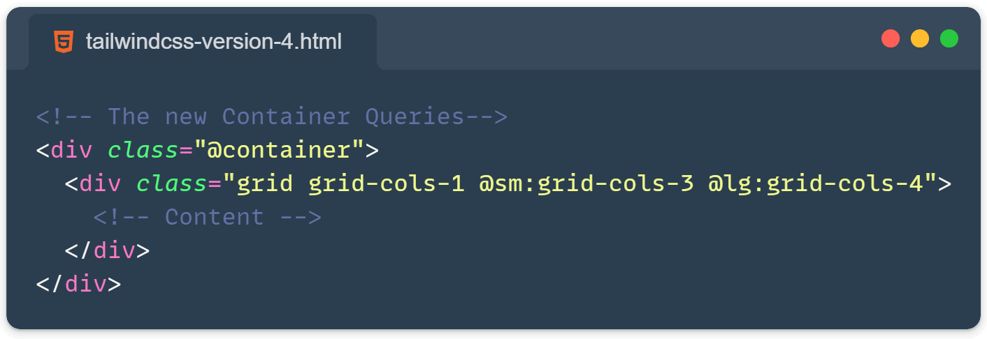
<div class="@container">
  <div class="grid grid-cols-1 @sm:grid-cols-3 @lg:grid-cols-4">
    <!-- Content -->
  </div>
</div>
In the above example, the grid will shift to 3 columns not when the window reaches the small size, but when the container itself does. This is incredibly useful for creating more flexible and responsive layouts!
The new not-* and in-* variants
Tailwind now includes support for :not() and :hover * through the new not-* and in-* variants.
<button class="bg-red-600 hover:not-focus:bg-red-700">
  <!-- ... -->
</button>

<div class="opacity-50 in-focus:opacity-100">
  <!-- Will have opacity: 1 when *inside* a focused element -->
</div>
These additions are a great step forward and an effective way to uphold the consistency of atomic styling principles.
The inert-* and nth-* variants
These variants come with some challenges. They allow the use of [inert] and :nth-child() selectors in your class names, which promotes practices that atomic CSS—especially Tailwind—has traditionally aimed to avoid.
On the bright side, these variants don’t encourage “styling at a distance.” While they might contribute to CSS bloat, their impact isn’t likely to be particularly harmful.
Support for the field-sizing property
The field-sizing property isn’t widely supported in CSS just yet, but once it is, it’s going to be amazing! It allows for auto-resizing textareas using only CSS, no JavaScript is needed. Check out the demo on Tailwind’s website here: https://tailwindcss.com/docs/v4-beta#field-sizing-utilities
Enriched Color Palette
Transition to oklch Color Space: Tailwind CSS 4 adopts the oklch color space instead of the traditional rgb. This change enhances color consistency across different screens and improves vibrancy, making it a more modern choice for web design.
What is oklch? Read more about it here: https://developer.mozilla.org/en-US/docs/Web/CSS/color_value/oklch
Extended Color Palette: The updated palette includes a wider range of colors, with every color from the extended palette available by default. This includes previously disabled colors such as cyan, rose, fuchsia, and lime, along with all five variations of gray.
Opacity Modifiers: Tailwind 4 introduces a new syntax for opacity modifiers using color-mix, allowing developers to easily mix colors and adjust their opacity. This feature simplifies the use of opacity in color utilities.
Default Border and Ring Colors: The default border color is now set to currentColor, which helps prevent errors when using custom palettes. Additionally, the default ring utility has been changed to a 1px size for consistency.
Custom Color Configuration: Users can still customize their color palettes by defining specific colors in the tailwind.config.js file. This allows for tailored designs while still utilizing the extensive default palette provided by Tailwind.
Gradients
Among Tailwind CSS version 4 new features, the support for radial and conic gradients is a notable improvement. However, I’ve always felt that gradients in Tailwind could be handled better. Defining them inline can be clunky, and relying on CSS variables for this feels a bit off. Classes like from-indigo-500 via-blue-400 to-teal-300 don’t feel at home in the HTML itself.
It would be great if Tailwind came with a set of beautiful, ready-to-use gradients out of the box while allowing developers to customize gradients in the config file as needed.
That said, this isn’t a new concern—it has always been possible to skip these utilities and define gradients directly in the configuration file.
There are a bunch more new goodies, try the new Tailwind CSS 4 here: https://tailwindcss.com/docs/v4-beta#getting-started
More Tailwind CSS tips here: https://front-end.tips/tag/tailwind-css/
