I love working with Tailwind CSS, the main reason is that I can quickly prototype my idea on the screen. One feature that constantly makes me smile is the group and peer modifiers. These little helpers have completely changed how I style elements based on their siblings or parents. Trust me, they’re going to make your life so much easier!
Group: Style Children Based on Parent State
You know that moment when you want to change multiple child elements when hovering over their parent? That’s exactly what group it is for! Let me show you a real-world example:
<div class="group flex items-center gap-2 p-4 hover:bg-slate-100 rounded cursor-pointer">
  <svg class="w-6 h-6 text-gray-500 group-hover:text-blue-500" fill="none" viewBox="0 0 24 24" stroke="currentColor">
    <!-- your icon path here -->
  </svg>
  <span class="text-gray-700 group-hover:text-blue-600">Hover me!</span>
</div>
In this example, when you hover over the parent div:
- The icon changes from gray to blue
- The text also changes color
- The background gets a subtle gray tint
But here’s the cool part – we didn’t need any JavaScript or complex CSS! The group class on the parent and group-hover: prefix on the children make it all work automatically.
Peer: Sibling Elements FTW
Now, let’s talk about peer. This one’s perfect for form inputs, toggles, or any situation where you want one element to affect its sibling. Check this out:
<div class="max-w-md">
  <input
    type="email"
    class="peer w-full border rounded px-3 py-2 focus:ring-2 focus:ring-blue-500 focus:border-transparent"
    placeholder="Enter your email"
  />
  <p class="mt-1 invisible peer-invalid:visible text-red-600 text-sm">
    Please enter a valid email address
  </p>
</div>
Look at what’s happening here:
- The input has the
peerclass - The error message below uses
peer-invalid:visible - When the email is invalid, the message appears automatically!
One important thing to notice is that the peer class must always be added before the peer-* class.
Pro Tips for Tailwind CSS Group and Peer Modifiers
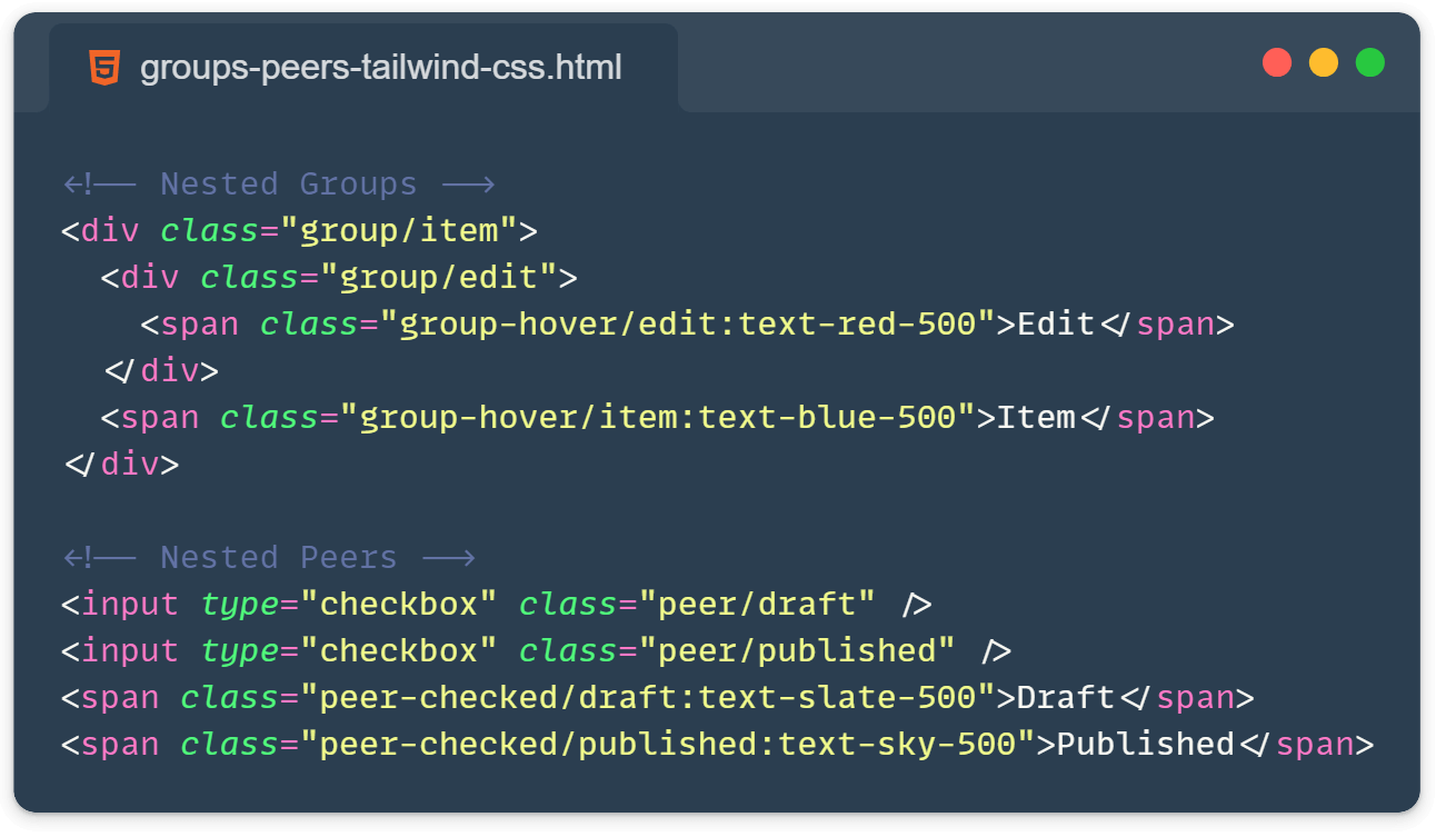
You can nest groups! Just use group/name to create named groups:
<div class="group/item">
  <div class="group/edit">
    <span class="group-hover/edit:text-red-500">Edit</span>
  </div>
  <span class="group-hover/item:text-blue-500">Item</span>
</div>
Peer modifiers work with multiple peers on the same level:
<input type="checkbox" class="peer/draft" />
<input type="checkbox" class="peer/published" />
<span class="peer-checked/draft:text-slate-500">Draft</span>
<span class="peer-checked/published:text-sky-500">Published</span>
Combine them with other Tailwind modifiers:
<div class="group lg:hover:bg-slate-200 dark:group-hover:bg-slate-700">
  <span class="group-hover:text-blue-500 dark:group-hover:text-blue-300">
    Responsive and dark mode ready!
  </span>
</div>
Demo time:
Here is a CodePen for both group and peer plus with a nesting example:
See the Pen Untitled by Ivo Culic (@ifkas) on CodePen.
When to Use What?
- Use
groupwhen you need parent hover/focus/etc. to affect children. - Use
peerwhen you need an element to affect its siblings.
Using Tailwind CSS group and peer modifiers has revolutionized how I handle interactive styling. They’re essential for writing cleaner, more maintainable code.
Learn more:
- From the official Tailwind docs: https://tailwindcss.com/docs/hover-focus-and-other-states#styling-based-on-parent-state and https://tailwindcss.com/docs/hover-focus-and-other-states#styling-based-on-sibling-state
- Subsequent-sibling combinator – https://developer.mozilla.org/en-US/docs/Web/CSS/Subsequent-sibling_combinator
- Check some more Tailwind CSS tips I wrote here: https://front-end.tips/3-useful-tailwind-css-tips-part-1/
