The :out-of-range and :in-range are CSS range selectors that work with form input elements that have range limitations, such as <input type="number"> or <input type="range"> with min and max attributes.
:out-of-rangeselects input elements with values outside the specified range.:in-rangeselects input elements with values within the specified range.
Let’s see how we can put these selectors to work!
Practical example: Age verification form
Imagine we’re creating an age verification form for a website. We want to visually indicate when a user enters an age that’s out of the acceptable range. Here’s how we can do that:
<form>
  <label for="age">Enter your age (18-99):</label>
  <input type="number" id="age" name="age" min="18" max="99" required>
  <span class="feedback"></span>
</form>
Now, let’s style it with CSS :
input:in-range {
  border: 2px solid green;
}

input:out-of-range {
  border: 2px solid red;
}

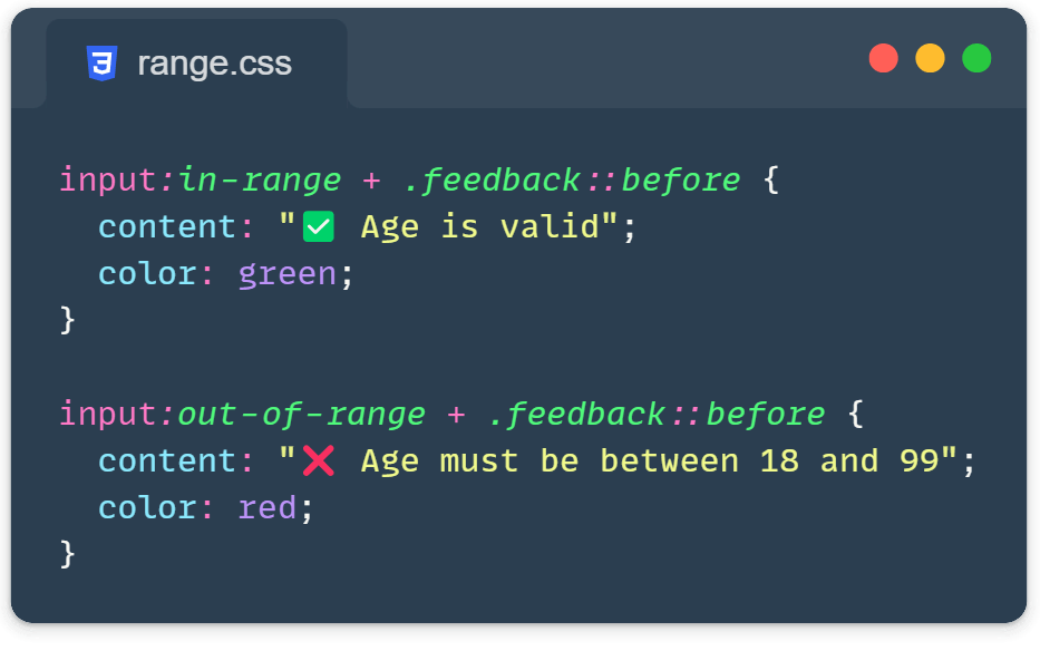
input:in-range + .feedback::before {
  content: "✅ Age is valid";
  color: green;
}

input:out-of-range + .feedback::before {
  content: "❌ Age must be between 18 and 99";
  color: red;
}
In this example:
- When the input is
:in-range(18-99), it gets a green border and a checkmark feedback. - When it’s
:out-of-range(<18 or >99), it gets a red border and an error message.
Tip: Let’s shake it a bit!
We can take this a step further and make it a more interactive user experience. Let’s sparkle our age verification form with some animations:
@keyframes shake {
  0%, 100% { transform: translateX(0); }
  25% { transform: translateX(-10px); }
  75% { transform: translateX(10px); }
}

input:out-of-range {
  border: 2px solid red;
  animation: shake 0.5s ease-in-out;
}

input:in-range {
  border: 2px solid green;
  transition: border-color 0.3s ease;
}

.feedback {
  display: inline-block;
  margin-left: 10px;
  transition: opacity 0.3s ease;
}

input:placeholder-shown + .feedback {
  opacity: 0;
}

input:not(:placeholder-shown) + .feedback {
  opacity: 1;
}
Here is a Codepen demo that I made where you can immediately test the action:
See the Pen Untitled by Ivo Culic (@ifkas) on CodePen.
Do we need to use these CSS range selectors?
As you already figure it out, the :out-of-range and :in-range allow you to create more intuitive forms that provide users with instant or immediate visual feedback.
However, here are some other valid reasons:
- Highlight invalid inputs instantly without JavaScript.
- Provide clear, visual cues for acceptable input ranges.
- Enhance the UX with smooth animations and transitions.
- Create more accessible forms by providing visual feedback in addition to standard form validation.
So, the next time you’re building a form, think beyond the basics because, with these CSS pseudo-classes, you can transform a simple input into an interactive, user-friendly experience that guides users effortlessly through your forms.
Just remember, use these nifty CSS range selectors to make your forms shine on the front-end, but don’t forget to pair them with robust back-end or server-side validation.
Learn more:
