When images fail to load, browsers display a default and ugly placeholder that can disrupt the user experience. According to me, styling broken images is often overlooked, yet it’s a crucial aspect of front-end development. And, as front-end developers, we should significantly improve this situation by styling the broken images and creating a fallback solution.
This post will guide you through creating custom, informative, and visually appealing placeholders for broken images. Let’s start directly with a demo presentation:
Demo time:
See the Pen Styling broken unresponsive images with CSS by Ivo Culic (@ifkas) on CodePen.
Please check the HTML/CSS tabs and the code in the above Codepen demo, you will notice the following:
- We use a wrapper div with the class
.broken-imageto contain our styling. - The actual
<img>is hidden when broken. ::beforeadds an emoji (you can replace this with any icon or content).::afterdisplays a custom error message using thedata-errorattribute.
and remember you can be creative as much as you want, the choice is yours!
A cross-browser JavaScript approach
While CSS techniques can be powerful, they sometimes rely on browser-specific behaviors. For a more consistent approach across browsers, we can use JavaScript. This method works reliably in almost every browser.
Here’s the HTML:
<img src="https://example.com/image.jpg"
     alt="Example image"
     onerror="
     this.onerror=null;
     this.src='/assets/placeholder-image.svg';
this.classList.add('image-error');">Let’s break down what’s happening:
this.onerror=null: Prevents potential infinite loops if the new image also fails to load. When an error occurs while loading the image, this handler replaces the image source with a predefined “broken image” placeholder.this.src='/broken-img.svg': Replaces the original image with a placeholder SVG.this.classList.add('broken-img'): Adds a class for additional styling.
You can then style the broken images with CSS:
.image-error {
    max-height: 2em;
    border: 1px dashed #ccc;
    padding: 10px;
    background-color: #f8f8f8;
}Using Tailwind CSS for efficient broken image styling
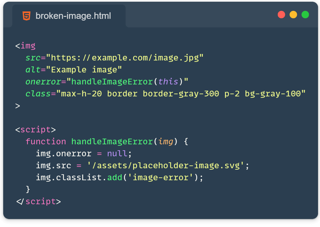
Do you fancy TailwindCSS just like I do? Then check this out:
<img
  src="https://example.com/image.jpg"
  alt="Example image"
  onerror="
  this.onerror=null;
  this.src='/assets/placeholder-image.svg';
  this.classList.add('image-error');"
  class="max-h-20 border border-dashed border-gray-300 p-2.5 bg-gray-100"
>To make this solution even more robust with Tailwind, you could use Tailwind’s @apply directive in your CSS to create a reusable class:
@layer components {
  .image-error {
    @apply max-h-20 border border-dashed border-gray-300 p-2.5 bg-gray-100;
  }
}Consider using a lightweight SVG image or a better webP image format for the placeholder.
Additional Tips:
- Always provide meaningful alt text for accessibility.
- Consider using SVG icons instead of emoji for better cross-platform consistency.
- You can create different styles for different types of images by using additional classes.
Styling broken images is more than just aesthetics—it’s about creating a better user experience. By implementing these techniques, you take care of the details professionally because you can turn a potential frustration point into an opportunity to showcase your attention to detail and care for your users.
Learn more:
- onerror: https://developer.mozilla.org/en-US/docs/Web/API/Window/error_event
- webP: https://developers.google.com/speed/webp
Related article: https://front-end.tips/5-image-optimization-techniques-to-supercharge-your-website/