Today, we’re diving into some important website accessibility tips that will make your websites more inclusive and user-friendly for everyone. These easy-to-implement strategies will boost your site’s accessibility and improve user experience across the board.
Why is Web Accessibility So Important?
Before we jump in, let’s quickly chat about what web accessibility means. In a nutshell, it’s about making sure everyone, including people with disabilities, can use your website. This covers many considerations, from visual impairments to motor difficulties and cognitive challenges. The goal? To create a web that’s open and accessible to all!
Now, let’s look at 8 important ways to boost your website’s accessibility:
1. Use relevant ARIA roles and attributes
ARIA (Accessible Rich Internet Applications) is like a secret weapon for accessibility. It helps bridge the gap between complex web applications and assistive technologies.
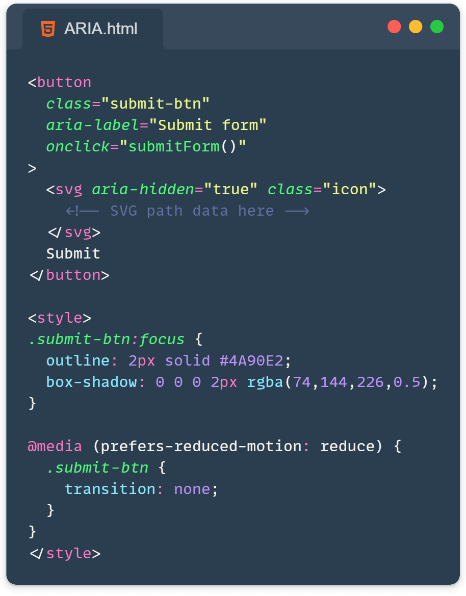
Here’s a quick tip: Use ARIA roles to give more context to your elements. For example:
<button role="button" tabindex="0" onclick="submitForm()">
  Submit
</button>This tells screen readers that this div is a button. Cool, right?
2. Embrace semantic HTML elements
Think of semantic HTML as your accessibility BFF. Instead of using generic <div> and <span> elements for everything, try using more descriptive tags. For instance:
- Use
<nav>for navigation menus <article>for blog posts or news stories<header>and<footer>for… well, headers and footers!
This helps screen readers understand the structure of your page better. It’s like giving them a roadmap of your content!
3. Make sure focusable elements have focus indicators
Ever tried navigating a website using just your keyboard? It can be pretty tricky if you can’t see where the focus is. That’s why focus indicators are super important!
:focus {
  outline: 2px solid #4A90E2;
  box-shadow: 0 0 0 2px rgba(74, 144, 226, 0.5);
}A little style like this can go a long way in improving navigation for keyboard users.
4. Make SVG icons accessible
Okay, confession time: I used to think icons were just pretty decorations. Turns out, they can be really important for understanding content! Here’s how to handle them:
- For decorative icons, use
aria-hidden="true"to hide them from screen readers. - For semantic icons (ones that convey meaning), add a descriptive
aria-label.
<!-- Decorative icon -->
<svg aria-hidden="true">...</svg>

<!-- Semantic icon -->
<svg aria-label="Search">...</svg>5. Pair input fields with labels
Labels are like name tags for your form fields. They help users understand what information goes where. You pair them with the attributes “for” on the label and “name” on the input, and make sure they are always the same, this way clicking on the label will focus on the relevant input. Always use a <label> element and connect it to your input:
<label for="username">Username:</label>
<input type="text" id="username" name="username">Your forms will thank you (and so will your users)!
6. Enable autocomplete
Autocomplete is like a helpful assistant for your users. It can save time and reduce errors, especially for people with motor or memory impairments. It is available on input, textarea, select, and form elements. Enable it like this:
<input type="email" name="email" autocomplete="email">7. Clear focus indicators for form fields
We talked about focus indicators earlier, but they’re extra important for forms. Make sure your form fields have a clear visual indication when they’re focused. It could be a color change, a bold outline, or even a subtle animation.
input:focus {
  border-color: #4A90E2;
  box-shadow: 0 0 0 2px rgba(74, 144, 226, 0.5);
}8. Make animations accessible with prefers-reduced-motion
Some people are sensitive to motion and animations. Luckily, we can cater to their needs with the prefers-reduced-motion media query:
@media (prefers-reduced-motion: reduce) {
  * {
    animation: none !important;
    transition: none !important;
  }
}This respects the user’s system settings and reduces or eliminates animations for those who need it.
And there you have it! Eight important website accessibility tips to make your websites more accessible. Remember, implementing these tips isn’t just nice to have—it’s an essential part of creating a web that’s truly for everyone.
Keep making the web accessible, one line of code at a time! 🖥️♿
Learn more:
